Results matching “fonts” from Ye Olde Rad Blog III

Web Typography & the Confusing EM

|

Web typography. It would seem to be a fairly simple topic, no? While I was reviewing some related concepts recently, the following question popped into my head » What exactly is an em?

EM | Usage in Web Typography 
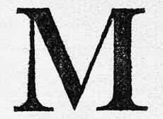
I've been using em's a long time, and knew they were based somehow on the letter 'M.' Wasn't sure however, if they were based on the size of the capital [M] or lower-case letter [m].

Also felt confident they were based on the horizontal measurement, but not certain. (In both cases, I was wrong.)

Trying to answer this simple question led to a surprising amount of confusion. Many sources on the web discuss ems, and detail their usage, without ever defining what exactly an em is.

Many pages are more complicated than need be. (It's not rocket science.) Finally have a handle on the topic, but my dang eyeballs are burning .. from reading so much.

First, let me answer the question I posed at the top, and therefore avoid the criticism I levied at many other sites.

An em is (drum-roll, please) » a unit of measure (.. defined by a certain number of pixels). So like inches & meters & light-years, which are also units of measure, the em is a » unit of LENGTH.

The thing that makes the em tricky is that » unlike inches or meters, or other fixed (or 'absolute') lengths, the em is a relative unit.

"Relative to what, Rad?" you might be asking. Relative to the font-sizing applied to (in pixels) its » parent element.

What this means is » the SAME font-size declaration (specified with ems) can yield DIFFERENT results (in pixels) .. when/if the parent element for each declaration specifies a different sized font. Hence, the confusion.

Reblog this post [with Zemanta]

Way of the World + Kisses & the Trough

|

Yes, I'm alive. (Been getting lots of mail.) This was the longest I ever went without posting an update .. short of backpacking in Yosemite for a month. Life. It gets gnarly sometimes. (You know the drill.)

I'm getting an education in the ways of the world .. the way things work .. the way things really work. Do you recall that song by Earth, Wind & Fire » Way of the World? It contains a verse:

Child is born
With a heart of gold
Way of the world
Makes his heart grow cold

I know a little 'bout where that song is coming from.

Don't want to leave the wrong impression, cuz we are good. Tho some are calling for their pound of flesh. Looking behind, I have no butt left. (Just a ragged stump.)

Friends say I'm being naive. And I can see they're right. (I appreciate straight-talking friends, who have the courage to say things I might not wanna hear.)

I'm also learning that *everybody* has their problems .. even people who seem like their lives are perfect .. especially people who seem like their lives are perfect. I'm talking about BIG problems. Problems that take years to overcome .. or are never fully surmounted.

I've noticed more people approaching me now .. to share extremely sensitive things .. and yes, I can relate. Maybe they sense this, which is why they feel comfortable approaching me with such heart-wrenching stories.

Hello August. Feeling pressure. Next month » D-day. I'm normally good at handling stress, but this has been relentless .. like white-water rafting for weeks, or months. Actually, it's been years (plural). And here come the rapids.

Pressure. Tension. Stress. (Long-term)

Pinback

If you listen carefully, you can hear things starting to crack. Tension. Makes life interesting.

Told the Dog yesterday, "I just want to be bored for one day. One day. Is that too much to ask?"

The dust won't settle 'til next month, but today was the first time I actually felt an air of victory .. like uh, that ol' dog ain't gonna bark no mo'. The writing is on the wall. (Thou art weighed in the balances and found wanting.)

This ain't to say I've emerged unscathed, or without scar. No. But we do what we must. Right? And victory here is defined narrowly as » not losing.

The Bug's Digital Milestone.dev

In related news .. I'm pleased to report a major developmental milestone » the Bug has mastered both point-n-click, and the click-n-drag.

Kid's software program at the library lets him click on a variety of colors (using paint-bucket palate-tool) and apply color to a picture by clicking on things such as » clouds (white), sun (yellow), trees (green), and sky (blue).

With click-n-drag, he can create rectangles or ovals, depending on the tool selected. To the ordinary observer these skills might seem trivial, but (as a certified geek) I recognized the development as a significant milestone in the digital age.

Learning Photoshop Mojo

|

Learning Photoshop. Been meaning to for a long time. I've tinkered for years, but now I'm learning the really cool (powerful, creative) stuff.

Adobe Photoshop CS3

At one time, Photoshop was "the killer app" » a reason in itself to buy a computer (Mac). And the more I learn, the easier it is to see why. (It lets you do way-cool things .. with graphics and photos.)

Over the years Photoshop has grown complex, somewhat beastly, difficult to tame. These days, learning to wield its magic takes a commitment. (As I'm finding.)

I had really wanted to wade into some server-side scripting and database management, but that requires even more of a commitment. Been too distracted for that. (Tho it's still on my list.)

Now however, I'm glad I went the Photoshop route. Everybody I've told says, "Yeah, I wanna learn Photoshop, too." (And once someone knows it, they'll always know it.)

What's that Strange Munching Sound?

|

Changed the font used for headings on the home page .. to Trebuchet MS, known for its modern, artsy style. (You like?) Before this, I was using Courier New, which seemed more computer techie-ish (which I also like).

Genghis KhanThis Font is Trebuchet MS

A better example of black text on white background can be found » HERE (VPS guide).

This Font is Courier New

Courier New is a mono-spaced font, which tends to consume more space (per character), forcing me to use shorter headings/titles (.. tho not necessarily a bad thing).

Regarding the text used on the home page, I still use Verdana, which can't be beat (I feel) for pure readability. Many times, I've tried to replace Verdana, but could never find another screen-font as easy to read.

Ye Olde Rad Blog II uses Trebuchet MS as its normal-text font. Not as readable, if you ask me.

On a more personal note, I am in the middle of "stuff." (Which is why I'm lagging on entries.) The kind of stuff you find wading thru a swamp infested with hungry crocodiles. (A particularly toothy one is chewing on my butt right now. Munch-munch.)

Find recent content on the main index or look in the archives to find all content.