Results matching “Website” from Ye Olde Rad Blog III

Feliz año nuevo. Most Content Management Systems (such as Drupal & MODx) work in conjunction with (require) a database. So do blogs (such as Movable Type) & forums (such as SMF).

MySQL is the world's most popular database software for web-based applications (.. such as CMS's & blogs & forums). It's what I use. It's the only database system I've ever used.

cPanel / Web Host ManagerThe Rad VPS (« physically located downtown Chicago) uses the cPanel/WHM control panel to help administer the site. cPanel makes it stupid-easy to create a new MySQL database.

You simply » enter a descriptive name for your new DATABASE (such as » rad_modx) and click the button labeled 'Create Database.' cPanel talks to MySQL and creates the database for you. Viola! Done. Too easy.

To use your new DATABASE, you'll also need to create a USER (such as » rad_modx, conveniently same as the database_name). Give this USER a password and click the button labeled » 'Create User.' Voila! Done creating new USER.

Lastly you need to assign a particular USER to a particular DATABASE. You do this by selecting both from their respective drop-down menus (one lists all available DATABASES, the other all possible USERS) and clicking the button labeled 'Add.'

Then you assign to this USER the appropriate PRIVILEDGES (normally ALL) necessary to perform the database functions. Click the button labeled 'Make Changes' and you're done. Voila! As if this weren't easy enough, cPanel even has a wizard to walk you thru these steps.

MySQL Database ManagementSo, in order to configure a database to work with a particular web application (such as Drupal or MODx), you need 3 pieces of info:

  1. database_name
  2. user_name
  3. user_password

Couldn't be easier. Tho I sometimes forget the final step of actually assigning the USER to the DATABASE (after creating both). Creating new DATABASES is not something I do on a regular basis.

RADIFIED currently uses 5 databases. Three for the blogs » 1-each for the 3 different versions of Movable Type I have installed .. based on v263 (installed 2003), v335 (installed 2007) & v432 (installed 2008). Another for Drupal (2008). And 1 for MODx Revolution (beta5), which I installed a few days ago.

The Rad forum, which uses YaBB, doesn't use a database. (At least not yet.) Might be worth noting here that Movable Type, Drupal, MODx & YaBB are all OPEN SOURCE (better than free) .. as is MySQL.

While installing MODx a few days ago, I noticed they include an option to test your database connection & credentials .. to see if MODx can access it okay.

Created a dedicated 'Guides' page. See here » Radified Guides. Been meaning to do that for .. eons. This will allow me to off-load the guides listed here on the home-page, so I can clean it up.

MODx Content Management System (CMS)I indented & right-aligned every other link .. to make them easier to read. What do you think? When the links were all lined-up together & left-aligned, they seemed too .. similar.

Eventually I'd like to include a representative graphic for each guide/link. But for now, I just wanted to create a page that contains a repository of the links to all our guides.

On a related note, I've been looking more deeply into MODx, the Content Management System (CMS). They are fixin' to release a new version (complete-rewrite, from the ground up, based on PHP5) .. called » REVOLUTION. (Current version is called » EVOLUTION.)

Drupal would be cool, but it's way too sophisticated for what I need. I don't want/need a PhD in CMS's. Here's a MODx site, for example. (I used to live in Lancaster, PA .. the heart of Amish country. Nice people there.)

I'd like to become intimately familiar with a good CMS .. as another skill to add to my digital toolkit. Only way to do that is » use one daily.

The good people at MODx claim a 'Release Candidate' version of REVOLUTION will be coming » "Winter 2009" (.. which is now). [ Notice how the words 'Summer 2009' have been lined-out. ] UPDATE » They just changed the RC date to "Spring 2010". Hmmm.

The MODx site is running REVOLUTION. I'm in no hurry, tho. Rather make a good decision than a hasty one.

The White House (Gasp!) Goes Drupal

|

The White House re-launched its website on Drupal. Can you believe that? Not sure why this blows my mind. In searching the web however, I see many others have also sat up and taken notice.

George Washington at the White House running on DrupalNo doubt the White House has content to manage. Sure.

But I think the reason it's so unexpected is that Drupal is simply too cool & cutting edge for the White House .. which we normally associate with stodginess and somnolent formality.

Then there's the fact that Drupal is not an American product. It was born in Belgium, at the University of Ghent (.. as a message board for fellow-students enrolled there).

And you know how RADICAL college students can be. Downright revolutionary at times.

It could also be that we associate politicians with being less-than-honest about their true intentions .. while Drupal is open source, and therefore completely transparent. (Imagine how people might feel if Hitler were caught parading around town wearing a scarf knitted by Mother Teresa.)

Dare I mention how the government TAKES your money .. without even a thank-you note, and gives it to people who have much too much already. While Drupal, released under GPL, is better than free (as in 'free beer'), cuz it's also open source (free as in 'freedom').

The whole thing feels grossly incongruent .. as tho two vastly different worlds have collided. Matter and anti-matter. Good omen, tho .. for both the White House and Drupal.

CSS Image Replacement & Other Misnomers

|

Happy Halloween. I modified the method of placing the graphics in the header found at the top of the home page .. up where it says » RADIFIED | Nuclear Grade Technolust. There I implemented a technique known as » CSS Image Replacement, of which there exist many variations, each with its own set of pro's & con's.

HalloweenThe dividing-line among web designers seems to be whether or not to use a non-semantic span tag with CSS positioning, which involves a more complicated technique .. but leaves visible TEXT in place for visitors who surf the Web with STYLES turned off (primarily those using mobile devices).

I used a simpler IR technique, by changing the images you see displayed there .. from foreground images to background images.

This allowed me to replace the foreground images (contained in those heading elements) with TEXT .. which I then indented (way to your left), so it can't be seen. By moving the TEXT out of the way, this technique reveals the graphics (.. which look prettier than standard heading-text).

The advantage however, is » devices that don't render styles (such as screen readers and mobile devices) will now see a TEXT heading and tag-line displayed there, where before there existed only images. Search engines also gives more weight to TEXT than images.

Most Rad visitors will never notice the difference .. seeing most who frequent the site (fellow technolusters) browse with both images and CSS turned ON. But I'm gradually filling my webmaster toolkit with increasingly sophisticated techniques. (Learning by doing.)

After all the pages are styled however, and the markup is coded semantically, there's still no substitute for insightful content .. that is well written (.. and hopefully seasoned with a dash of personality).

This has always been the most difficult challenge .. because a stylish suit does not a charming pig make. And the ugliest person can say the profoundest things, and possess scintillating ideas. So it would seem that content trumps style .. no matter the venue (.. except maybe for those who focus on style).

Reblog this post [with Zemanta]

Semantic Markup & Passing Inspection

|

Changed the underlying markup that controls the links in the blue-green sidebars on the home-page. They were previously coded as » paragraphs. I changed them to » list-items .. cuz that's what they are » a list of items (links) grouped according to category. Certainly not paragraphs .. not even sentences.

Website InspectionIf I did this correctly, you shouldn't notice any difference. Cuz I applied the same styling to the list items .. tho this was trickier than it might sound. I nearly freaked when a single misplaced comma trashed my whole layout. Yikes!

This change represents a semantic improvement. Semantics (i.e. » 'meaning') is one of the buzz-words kicked around when thinkers discuss the Web's future.

Most surprising was that it took me so long to realize I had coded the home-page with semantically incorrect markup. It suddenly hit me (last night), when out of the blue (actually » blue-green), I thought » "Those links aren't paragraphs; they're a LIST."

Reblog this post [with Zemanta]

While surfing the web recently, I've noticed more website authors including a photograph of themselves on their home page (.. places such as here & here) .. aka 'mugshots'.

Mug ShotI forget when I added it, but my mugshot has been posted there for quite some time. It was taken at night (at the Noguchi sculpture garden in Costa Mesa after a yummy Italian dinner), and the flash illuminated only my image (nothing behind). So the background is dark .. which works nicely with the page design (dark background).

I even sampled the exact shade of black contained in the photo's background, so I could blend the photo perfectly into its surrounding box.

Personally, I like to see a photo of the authors whose sites I visit and whose articles I read. It's been said » the eyes are the windows of the soul. In other words, you can get a good idea of a person from a photo.

It actually took more courage than you might think to post that pic there .. so prominently .. for all the world to see .. the online version of stagefright. (Tho I wouldn't be surprised if some printed it out, blew it up, and used it as a dartboard .. or for other things.)

If you view this home page in Firefox (or a browser other than IE or Opera), you'll notice I added some rounded corners.

The rounded corners of this box use graphics to achieve its effect (1 in each corner). Not as cool as pure-CSS. But that's why you can see these rounded corners in IE & all browsers. This box will expand and shrink (down-n-up) as necessary to accommodate text inside, as its width is fixed (to 205 pixels).

Been reluctant to spend much time focusing on site styling, preferring rather to concentrate on generating » content.

In the world of cars, for example, I've always preferred the spartan cockpit of a Porsche to the bells & whistles you find sitting in a corvette. Tho admittedly, that's just my druthers.

My point » function should never take a back seat to form.

I've considered adding rounded corners many times before. Countless techniques exist. But they always seemed a kludge. (Andy agrees.) So I never felt it worth adding the extra markup necessary.

Techniques that use graphics to achieve their effect involve inserting additional HTML elements that are otherwise unnecessary, because current CSS standards (v2.1) allow only 1 background image per element (while each box has 4 corners). Future versions of CSS (v3.0) will support 8 images per element (for this very reason).

This approach has 2 main problems. First, adding (otherwise) unnecessary markup goes against all that is holy to the Web Standards movement, which touts the tenent of 'Semantic Markup' as one of its pillars.

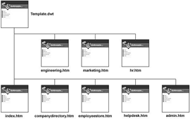
If I knew then what I know now. Ever uttered those words? Looking back on my progression of web skills, one omission stands out » incorporating the use of templates to help develop & maintain the pages of my web site.

Templates are both powerful & flexible for two reasons:

  1. They speed up site development, by allowing the rapid creation of web pages based on a preformed (uniform) structure .. so all your pages have the same look & feel.

  2. They facilitate site maintenance, by enabling structural changes site-wide via the editing of a single-file .. similar to how CSS works. This aspect of templates is considerably more significant than item #1.

Dreamweaver TemplatesIf your web site grows bigger than expected (as they usually do), and you want to make structural changes (non CSS-based changes) to your web pages, you'll have to edit each page individually (.. which suks giant goose eggs). Tedious maximus.

When CSS came along, website designers could transfer all style controls into a single file, so that the look of an entire site could be modified by editing a single file (provided, of course, the entire site was based off of the same style sheet). Very cool development.

But what about structural changes? That's where templates come in. To be honest, I'm not sure if web design programs (such as Dreamweaver and Expression) had the ability to generate templates back when I launched the site. But they do now.

With world-economies teetering somewhere between a nasty recession and full-on depression, more folks are turning to open source (free) software to meet their home computing needs.

If you've been Radified any length of time, you know that cloning programs are our specialty, especially when used as a tool to backup your system partition (where Windows resides) by creating an image file.

ClonezillaSo the question naturally becomes » What's the best free cloning program?

I've tried many options, such as Macrium and O&O DiskImage Express, but never quite found what I was looking for .. until today, that is.

Perhaps I should interject by saying that, regarding the NOT-free solutions, I've found that Ghost, along with Image-for-Windows to be the best for-co$t disk-cloning tools. (By 'best' I mean » most reliable.) Ghost is also way faster than any other cloning product I've demo'ed .. if speed is important to you.

Lots of people also like True Image, but I had problems with it. (Errors I couldn't resolve.)

But what if you can't afford those apps? Then what? We still need an industrial-strength (nuclear-grade) backup tool. Enter Clonezilla. (Standing ovation.)

First, I'm not crazy about the name .. nor the website's design, especially the tiny menu on the left-side that I can barely read. (Update - looks like they fixed the tiny-menu problem after I posted this.)

Heck, I don't even like their logo (white Linux penguin inside orange penguin). But I *am* impressed with the tool itself .. now that I've had a chance to try it.

Yes, it's significantly more complicated to use than either Ghost or Image-for-Windows, but I don't feel this complexity is a barrier to those with a moderate degree of computer sophistication. (Such as the folks who frequent Radified.)

Note that .. a cloning program can (if used inadvertantly) trash your entire system and wipe out every every file on your hard drive .. with a single click. So you can't experiment like you can with other programs (.. such Photoshop Elements or Sound Forge, for example). In other words, you need to know wtf you're doing.

Perhaps I should begin by defining some terms.

CSS-based Tabbed Menu (Centered)

|

Created a tabbed menu today .. something I've been meaning to do for ages.

Kandinsky's Black Spot

The menu displayed at the top of the homepage is pure-CSS driven (no images used). Using images would allow for more creativity, but would also add to the page's download-weight. (And I use enough images already .. in the daily entries.)

My goal was to design a tabbed menu that was both simple & functional. I'm pleased with how it turned out .. tho it took a surprising amount of tweakage to get it to look the way I wanted.

Now that I've developed a basic format, I can tweak & adapt as necessary.

Might look simple, but centering that menu had me jumping thru hoops. I reviewed several methods and finally decided to modify Ethan's approach .. so it would resemble the cleanness of Eric Meyer's tabbed navbar (which is not centered).

HTML compression via Apache mod_deflateBeen reading about web site optimization (WSO), which stresses the importance of small, fast-loading web pages, that are lite on graphics.

First thing I did after analyzing some of my web pages in this cool analyzer .. was to remove the Lightbox script (even tho it was way cool), cuz it was costing me nearly 200-KB. (Ouch!)

Never realized Lightbox was so big. Actually Lightbox itself is only 18-KB, but it uses/needs Prototype.js (which is 124-KB) and Effects.js (which is 40-KB).

Didn't take long, once I delved into the world of WSO, before I began hearing about the virtues of » HTML compression.

Like WinZip for web servers, HTML compression squeezes web pages before sending them to you, which saves bandwidth. (Radified uses ~50 gigs monthly.)

What's that Strange Munching Sound?

|

Changed the font used for headings on the home page .. to Trebuchet MS, known for its modern, artsy style. (You like?) Before this, I was using Courier New, which seemed more computer techie-ish (which I also like).

Genghis KhanThis Font is Trebuchet MS

A better example of black text on white background can be found » HERE (VPS guide).

This Font is Courier New

Courier New is a mono-spaced font, which tends to consume more space (per character), forcing me to use shorter headings/titles (.. tho not necessarily a bad thing).

Regarding the text used on the home page, I still use Verdana, which can't be beat (I feel) for pure readability. Many times, I've tried to replace Verdana, but could never find another screen-font as easy to read.

Ye Olde Rad Blog II uses Trebuchet MS as its normal-text font. Not as readable, if you ask me.

On a more personal note, I am in the middle of "stuff." (Which is why I'm lagging on entries.) The kind of stuff you find wading thru a swamp infested with hungry crocodiles. (A particularly toothy one is chewing on my butt right now. Munch-munch.)

Find recent content on the main index or look in the archives to find all content.