Results tagged “XHTML” from Ye Olde Rad Blog III

"Hey Rad Man!" began an email I received last week. "I'll pay $100 for a link on your Downloads page." Of course, there's no way of knowing if such offers are legit .. until the cash arrives.

 BenjaminI've researched Search Engine Optimization (SEO) enough to know I don't much care for it.

Programming I enjoy, but SEO contains a seemingly endless amount of info to digest, some of which conflicts from site to site.

And the suggested techniques are often time-consuming, with dubious results that demand the patience of a saint before you start to see results. Rather focus my energies on generating original content.

Moreover, some of the techniques used to 'optimize' web pages (for higher search engine rankings) seem manipulative, if not downright dishonest. Many of the SEO sites I've visited have a 'slimy' feel to them » detailing how to trick search engines into ranking your pages higher.

I learned that links from 'ranked' pages will (in turn) yield greater 'importance' to the pages that those links aim at (point to). This is (I assume) what this person had in mind when she contacted me.

The email seemed both professional and specific. (Not slimy.) The girl was clear about what she wanted. And best of all, her proposal could be implemented minutes. (Simple.)

The problem was .. that the page they wanted a link on was created back when I knew squat about web standards (XHTML & CSS). The underlying mark-up (code) was a rat's nest of deprecated tags and coding no-no's.

Downright embarrassing .. from a webmaster's point-of-view. Miracle the page would render at all (.. even in 'quirks' mode).

Reblog this post [with Zemanta]

CSS-based Tabbed Menu (Centered)

|

Created a tabbed menu today .. something I've been meaning to do for ages.

Kandinsky's Black Spot

The menu displayed at the top of the homepage is pure-CSS driven (no images used). Using images would allow for more creativity, but would also add to the page's download-weight. (And I use enough images already .. in the daily entries.)

My goal was to design a tabbed menu that was both simple & functional. I'm pleased with how it turned out .. tho it took a surprising amount of tweakage to get it to look the way I wanted.

Now that I've developed a basic format, I can tweak & adapt as necessary.

Might look simple, but centering that menu had me jumping thru hoops. I reviewed several methods and finally decided to modify Ethan's approach .. so it would resemble the cleanness of Eric Meyer's tabbed navbar (which is not centered).

Rad Goes Strict (XHTML 1.0)

|

I converted the homepage to » XHTML 1.0 Strict (document type declaration) from XHTML 1.0 Transitional (which applies the rules associated with rendering web pages more loosely).

Strict

Only problem I had was the square Google AdSense ad, which I've traditionally wrapped in a <table> tag/element .. which is not the correct way to code it. (Cuz it's not really a table. Rather it's a JavaScript script.)

In Strict, I needed to convert the <table> to a <div> and "float it" left (in CSS) .. otherwise none of the other text would wrap up alongside the ad (like it does now).

All the images in the center section had to be assigned a class and 'floated' right (in CSS), cuz the Strict DTD does not allow you to align="right" .. like I used to do.

Aligning deals with "presentation" (as opposed to structure and content), and the Strict DTD moves everything pertaining to presentation out of XHTML (and into CSS).

I'm actually fairly comfortable with the requirements of the XHTML 1.0 Strict DTD .. enough to begin creating all new pages using the Strict doc-type declaration.

Rad Web Design Studio

|

It has been a week since the home page was redesigned .. with a new table-less layout. Have you gotten used to it yet? Like it? (I'm diggin' it.) Been making slight tweaks here and there...

.. such as adding left-padding to the graphics in the center section, to keep text from butting up against images.

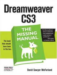
Dreamweaver CS3: The MIssing ManualThis padding also adds a slight indent (6 pixels) to the yellow tri-blade radiation symbols which begin each post.

Speaking of design .. I got a call from somebody saying they wanted to hire me to redesign their web site. (Cool.) My nuclear training instilled in me the notion that I need to know everything about everything before doing anything professionally.

Which might be true in the nuclear world, but friends say that ain't how the real world works, and that I already know more than enough to do web design professionally.

And I must admit, after reading (studying) those excellent books (» Head First XHTML/CSS, » CSS Mastery & » Dreamweaver: The Missing Manual), I *do* feel comfortable wielding web design mojo.

So if you know somebody who needs web work, I'm available. (And cheap.) I don't know PHP yet, but that's coming. Rad Web Design .. has a nice ring, no?

Note: today's entry applies to the site home page (not this blog entry page).

Notice anything different? The old/previous design was based on pre-XHTML standards mark-up .. which I had *converted* to XHTML-valid (using Dreamweaver). But the guts still contained a table-based layout (kludge).

The layout of this page however, is not based on tables (rather » on CSS). My new CSS page (if you're interested) is aqui » radified_xhtml2.css.

Been meaning to start over from scratch and layout this page based on CSS .. ever since I started upgrading my web design skills.

Now that the site is busy enough to require a VPS, I figure we probably oughta have a homepage laid-out with CSS. (Modern.)

So I finally just put my head down and went for it. Spur-of-the-moment decision. More involved than I expected. A million little details required attention .. in order to massage current content (you see here) into the new layout. And once I start a project like this, I don't like to stop until it's done. (Worked 'til 1AM.)

This CSS-based layout will let me tweak the design more easily as my CSS skills (continue to) develop.

I chose that bluish-green color (sidebars) cuz I was searching for a link-color that doesn't distract from reading this normal gray text.

The old light-blue links I was using before were so bright (on a black background) they jumped out .. which I found distracting, since I tend to use copious linkage. (Design should complement content .. not overpower it, right?) But sometimes we don't notice things, until we're looking for them. My design-aim was/is to present a content-focused website.

Tags

Find recent content on the main index or look in the archives to find all content.