» ![]() 2011.Feb.23 » When it comes time to build your dream home (.. up in Malibu, perhaps) you'll sit down with an architect, who will use your ideas to generate a set of blueprints. Builders will then use these blueprints as a guide to assemble your home. Cool.
2011.Feb.23 » When it comes time to build your dream home (.. up in Malibu, perhaps) you'll sit down with an architect, who will use your ideas to generate a set of blueprints. Builders will then use these blueprints as a guide to assemble your home. Cool.
 Information Architecture » Web Navigation
Here in the Information age, the term » information architecture (IA) is the name given to this "blueprinting" (if you will) that we use as a 'schematic' ..
.. to build things where information is the thing being structured. And we build these informational structures in such a way as to make their access easy as possible (.. more logical & intuitive).
Instead of specifying the precise relationships between things such as brick, wood & wiring, IA specifies the hierarchical relationships of .. you guessed it! » chunks of information. (Think » library)
'Hierarchical,' ooh. Big word. Let's take a quick look at what it means. Simply » an ordered grouping of things. In other words » a group of things put in order.
For example, the labels » General, Colonel & Major are each part of a hierarchical grouping .. of military officers.
I'm no military buff, but these guys are definitely part of a well-ordered group (called the Army, which is itself part of an even bigger group-ing) that have a well-defined relationship with one another.
Likewise, a website contains INFORMATION that should be similarly well-structured and well-ordered .. in the relationships its various sections have with one another.
Information Architecture isnt nearly as complex as this mouthful-of-a-term might imply. In fact, it's actually rather commonsensical. Logical. Pleasing, in a left-brain sort of way. Its goal is to bring order to informaton that might otherwise appear chaotic.
The problem is .. that » most websites (ahem) relegate IA to an afterthought.
I know this was true for me. Sure, I can provide good excuses for this. But the bottom line » no IA leads to » poor site organization, which in turn leads to » poor navigation.
I mean, my navigation is (literally) all over the place. (Look around.) If I could start over, I'd do a better job. And I may do another redesign in the future (.. perhaps based on a 960-grid using Sass & Compass, which would be cool).
Today's entry continues & concludes in Ye Olde Rad Blog v4 .. see here » Information Architecture | The Professional Way to Develop Website Navigation
» ![]() 2011.Feb.15 » Radified is different from most other websites .. in that I didnt know where we were headed back when I launched it. Heck, it took a while just to figure out how to post a second page, and how to link to that page from the first. (No longer seem to have that problem.)
2011.Feb.15 » Radified is different from most other websites .. in that I didnt know where we were headed back when I launched it. Heck, it took a while just to figure out how to post a second page, and how to link to that page from the first. (No longer seem to have that problem.)
 Web Site Theme & Visual Metaphor
This is because Radified began as a learning experience .. to learn-by-doing. (Which is the best way to learn.) So learning new, cool geeky things has been a main THEME here.
Choosing a domain name, signing up for a web hosting server, and finding a good FTP client .. that all seems so elementary now. But back then (in the summer of Y2K) it was exciting new territory that required lots of research.
So you could say Radified has taken a more organic path than that of most traditional web sites, which typically know where they want to go (conceptually) .. before the first bit of HTML is ever coded. This organic path-of-development applies also to » styling.
In reading about Web Design, one of the first concepts they hammer into your head is that of » identifying the THEME of your site. Once identified, you set out to develop a VISUAL METAPHOR to help support and promote that theme.
For example, a web site for a coffee shop (whose THEME is obviously » coffee) might use colors like mocha, the color of a cup of coffee, or cream, or even an image of some coffee beans .. as part of their VISUAL METAPHOR.
[ Where websites are concerned, THEME is closely related to » PURPOSE. Purpose determines content, and content determines THEME. ]
You can take the concept of VISUAL METAPHOR far as you like, going totally ape, or you can keep it subtle. I've always preferred subtle, understated styles. But that's just personal preference.
Even tho I've never studied the principles of VISUAL METAPHOR, or even heard of the term before reading this book, you can still see hints of it in my design here on the home page (.. with its stated THEME of » Nuclear Grade Technolust).
For example, beginning each entry you'll find a yellow tri-blade radiation symbol .. making it easier to identify where each entry begins (notice how design is subordinate to » function) .. especially since it's the only thing yellow on the page, and yellow stands out so eye-catchingly on a black background.
[ Using a car-metaphor, I prefer the function-follows-style philosophy of Porsche to the style-leading flair of the Corvette. Again, this is merely personal preference. ]
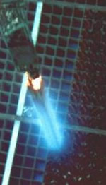 » Cherenkov Radiation & the Blue-Green Sidebars
The color of the sidebars was inspired by Cherenkov radiation. You can actually SEE this radiation .. coming off the (super highly radioactive) spent fuel cells that are stored in water-filled pits (made of stainless steel, some 50-feet deep) at most commercial nuclear power plants ..
[ .. at least, until the government comes up with a plan to dispose of them. But nobody wants highly radioactive material buried in their back yard .. that will remain highly radioactive for thousands of years. Who knows what life and the climate will be like a thousand years from now? ]
This visible light (known as the Cherenkov effect) comes from charged particles (beta particles, better known as electrons) accelerating faster than the speed-of-light in water (.. where these fuel cells are stored). Light travels slower in water than it does in outer space, which is mostly a vacuum.
Today's entry continues & concludes in Ye Olde Rad Blog v4 .. see here » Website Theme & Visual Metaphor
» ![]() 2011.Feb.10 » Started adding drop-shadows to my images. A subtle addition to our fine line of rad webware. To see these shadows drop .. you must visit their intended destination, which is my » Movable Type "professional publishing platform" .. where I maintain a traditional white background.
2011.Feb.10 » Started adding drop-shadows to my images. A subtle addition to our fine line of rad webware. To see these shadows drop .. you must visit their intended destination, which is my » Movable Type "professional publishing platform" .. where I maintain a traditional white background.
 Drop Shadows R Us
Myself I prefer to read text set on a black background, which I find easier on the eyes. More soothing .. than staring at a hundred-watt light bulb.
I even tone down the lettering, so it's not too bright. More silver-gray than white. Enough contrast for easy readability, but not much more.
The BEST thing about white backgrounds — other than the lovely searing effect they have on your retina — is » the ability to drop shadows. (Seems like a small price to pay, no?)
Drop-shadows produce a pleasant visual effect because they're so subtle. Dash of 3-D class .. for very little extra weight. They help lift those images off pages that are otherwise flat. Of course, it's really just an optical illusion. No such lifting actually occurs. It's all in your mind.
 » Editing Web Graphics with Adobe Fireworks
I use Fireworks to drop my shadows, a program Im really starting to dig .. compared to Photoshop, I mean.
Fireworks was designed specifically for web graphics. Photoshop never focused primarily on the web. Editing web graphics is what I do. Most of the time, anyway. Representative graphics that complement the various entries .. for the visually-oriented reader.
Learning Fireworks was one of the more rewarding things Ive done. That and the Linux shell. (Mad power there.)
[ Speaking of design changes, I also changed the roll-over color of the black buttons located in the blue-green sidebars .. from bright-white to a softer shade of silverish-gray.
Originally thought the white roll-over would play off the (white) top title bar. But the roll-over effect was just too strong. Ouch. Sometimes it takes a while before I realize some aspect of site design isnt working. ]
Drop shadows can be accomplished in CSS (snuck in as a background image under the foreground image), which is a neat trick, but it requires you muck-up your mark-up by adding non-semantic divs, which have no meaning. They're added for purely presentational reasons (styling). Something about that doesnt sit right with me.
[ In Fireworks, to add a drop-shadow, you simply click the little square '+' plus sign next to the word 'Filters' on the right side of the Property menu. Sometimes you have to select the black-arrow tool first .. in order for the 'Filters' button to appear. From there » Shadow and Glow » Drop Shadow. Voila! ]
A minor glitch Im running into » after CROPPING an image, I first need to Modify » Canvas » Canvas Size... to make room for the drop shadow.
Today's entry continues & concludes in Ye Olde Rad Blog v4 .. see here » Drop Shadows R Us
» ![]() 2011.Feb.09 » Picked up a copy of the Head First book on Web Design at our local library. Interesting, fun read. Ive previously looked into web useability, but never at Web Design, per se.
2011.Feb.09 » Picked up a copy of the Head First book on Web Design at our local library. Interesting, fun read. Ive previously looked into web useability, but never at Web Design, per se.
 Head First Book on Web Design
If I knew how cool it would be, I woulda looked into it much earlier. Or maybe now the timing is right.
This particular book is perfect for somebody like me .. who already knows XHTML / CSS. That's how the book describes its target audience.
I love the Head First series of books, which incorporates recent research from cogntive science, neurobiology & educational psychology. Ive read other Head First books.
Deep-thinking lies at the root of their mantra. Sometimes their technques may seem a bit corny, but they really do work. The bottom-line is » you get it.
Today's entry continues & concludes in Ye Olde Rad Blog v4 .. see here » Head First Book on Web Design
« News for January, 2011 « PREVIOUS || TOP || NEXT » News for March, 2011 || [Archive Index]

